

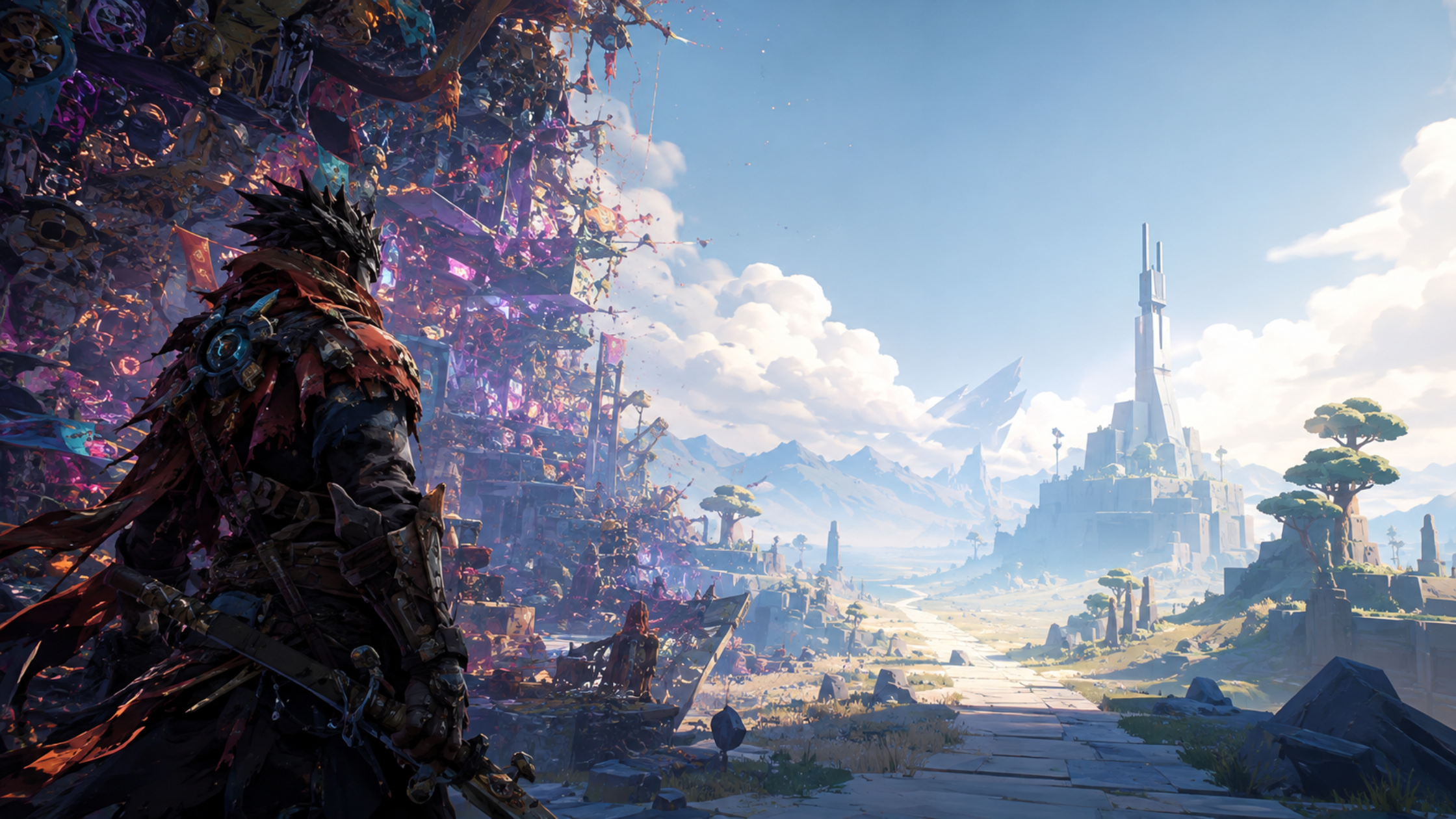
High-quality art that reads poorly at scale is still a failure. Understanding when stylization serves a game versus when it works against it.
There’s a persistent myth in the game industry that says if you just make the art good enough, audiences will follow. It’s a comforting story for artists. It’s also largely wrong.
Every few years a title ships with genuinely impressive, labor-intensive visual work that gets quietly ignored by the market. The art is beautiful in screenshots. In motion it feels disconnected from the genre’s expectations. In a Steam thumbnail or a social media clip it looks like something else entirely and not something better.
This is the stylization trap, and studios fall into it more often than anyone in a post-mortem is willing to admit.
An art style isn’t just an aesthetic choice. It’s a promise to the player about what kind of experience they’re about to have.
Consider what happened with the original release of Battleborn in 2016. Gearbox built a visually maximalist shooter with dense enemy designs, kaleidoscopic environments, and a distinctive comic-influenced palette. Technically, the art was competent. But the result read as visual noise difficult to parse in action, exhausting as a sustained environment, and impossible to communicate at thumbnail scale against the calm, readable spectacle of Overwatch, which launched in the same window.
Overwatch’s character designs are stylized, but they’re stylized with legibility in mind. Each hero is architecturally readable silhouette, color coding, proportional exaggeration all work together to tell a story instantly. That’s not an accident. That’s an art direction philosophy built around communication, not complexity.
The stylization trap typically springs in one of three ways. First: a studio commits to an art style that’s internally coherent but genre-inappropriate. A brutalist minimalist aesthetic on an action RPG tells players that this is a puzzle game or a walking sim. The mismatch creates friction before a word of marketing copy lands.
Second: a style is executed inconsistently. This happens most often in projects with large, distributed art teams or those using multiple outsource partners without a strong art direction layer on top. Individual assets look fine in isolation. Together they form something that reads as unfinished, cheap, or confused regardless of the per-asset quality.
Third: the style is ahead of its reference market. This is the most sympathetic failure mode. Games like Disco Elysium or early Hades found their audiences eventually, but their visual identities took time to build trust. For a studio without the runway to wait, ‘eventually’ isn’t a viable outcome.
What separates durable stylization from trendy stylization is whether the choices serve the game’s tone or serve the artist’s resume. Heavy outlining works in Cuphead because the entire production philosophy animation, sound, writing is committed to that 1930s reference. Used in a realistic military shooter, the same technique would shatter immersion in seconds.
Studios looking at stylized realism as a middle path detailed enough to signal quality, simplified enough to be readable are navigating this space intelligently. But stylized realism still requires a strong art direction spine. Without it, you end up with something that looks neither polished nor intentional, just expensive and vague.
The antidote to the stylization trap is establishing visual communication hierarchies early in production. Ask what each frame, screen, and asset needs to tell the player. Then ask whether the chosen style helps or hinders that communication. Beautiful art that confuses is still a failure. Readable art that’s merely competent can ship and succeed.
Art direction is fundamentally a service discipline. It serves the game’s identity, the studio’s commercial needs, and the player’s ability to orient themselves in a new world. Stylization that forgets this tends to produce work that’s impressive in isolation and ineffective in context and the market is not forgiving about the difference.