

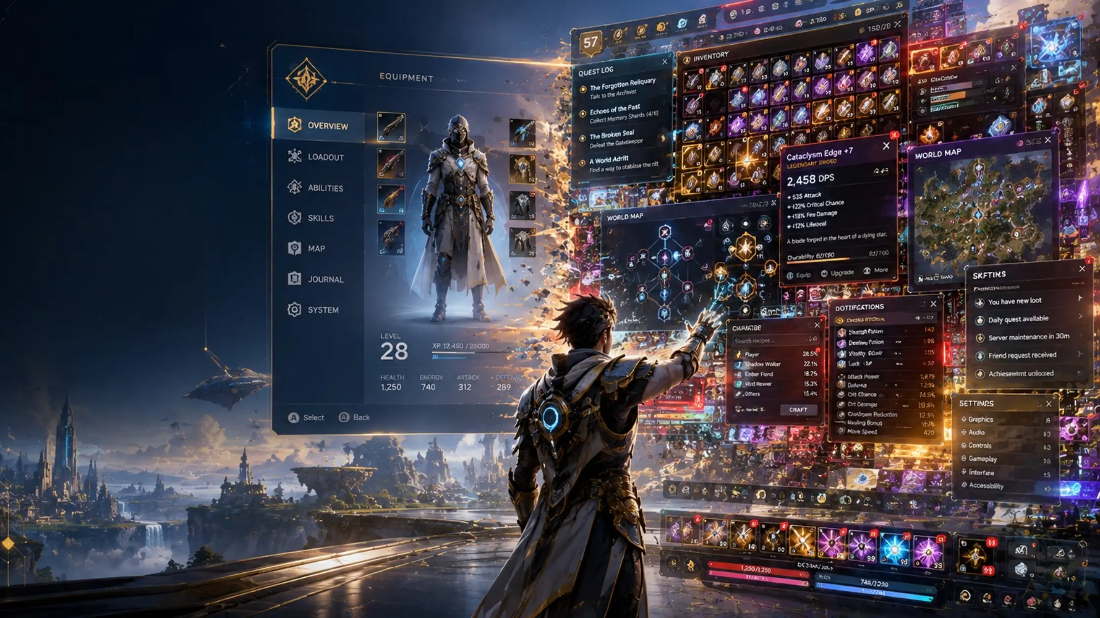
When UI design is treated as the last item on the production schedule, players end up with menus that fight the game they’re trying to play.
Open any recent thread about a major AAA release and there’s a predictable complaint somewhere in the comments: the menus are confusing, the HUD is cluttered, the inventory system requires a tutorial to navigate, and key information is buried three layers deep in a settings screen designed to demonstrate technical capability rather than solve a practical problem.
This is not a player perception problem. It’s a production problem, and it has a specific cause: UI/UX design in most AAA pipelines is resourced and scheduled as a finishing step rather than a foundational one.
The typical production logic goes roughly like this. Core gameplay systems are built first, by the most senior team members, with the most lead time. Art production runs in parallel on characters and environments. UI gets addressed in the back half of production, when the game’s systems are ‘stable enough to design around.’ This logic produces UIs that reflect the systems they were designed for rather than the experience players are meant to have because the UI designer was handed a finished system and told to make it navigable, not included in the system design conversation.
Most game UIs aren’t designed. They’re assembled layer by layer as systems were added and no one was ever empowered to question the resulting structure.
The difference in approach is visible in the output. Hades has a UI that feels like part of the game’s visual world every screen is consistent with the game’s graphic identity, and information is prioritized according to what players actually need at each moment. God of War (2018) managed an enormous RPG-adjacent system with a UI that remained readable and visually integrated. These aren’t accidents of talent. They’re the result of treating UI design as a design discipline that starts at the beginning of production, not six months before ship.
The worst offenders tend to be games with complex systems that were designed by engineers and then handed to visual designers to ‘skin.’ Inventory systems in particular suffer from this: they’re built around database logic, then wrapped in a visual layer that prioritizes displaying all available data over helping players make decisions with that data. The result is screens full of numbers and stats with no hierarchy, no contextual prioritization, and no connection to the player’s actual cognitive state while playing.
Mobile gaming has, paradoxically, produced more rigorous UI thinking than much of AAA development because on mobile, a confusing UI is fatal to retention, and retention data is immediate and precise. The discipline imposed by that feedback loop has generated UI design thinking that many console and PC productions would benefit from importing.
The fix isn’t purely a resource question. It’s a process question. UI leads need to be in pre-production conversations. UI design needs to be treated as an equal partner to gameplay and art in the production hierarchy, not as a service discipline applied at the end. That’s a cultural change in most studios, and cultural changes are slower and harder than budget increases but they’re also more durable in their impact.